Bernie Jenny


I am an Associate Professor at Monash University, Melbourne. My research focuses on cartographic maps and globes. I explore augmented reality and virtual reality for visualising and understanding spatial data, and I apply machine learning to visualising terrain in maps.


Embodied Visualisation Lab
Faculty of Information Technology
Monash University, Melbourne, Australia
bernie.jenny@monash.edu

Students: I’m looking for enthusiastic students, who want to combine immersive visualisation, computer graphics, augmented and virtual reality, cartography, geovisualisation, and geographic information science. If you are interested in working with me, explore my research project below and contact me.
 

Immersive Geovisualisation

Visualization Placement for Outdoor Augmented Data Tours

Stacks Image 1434
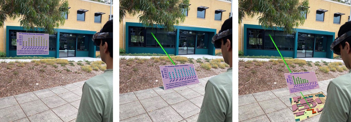
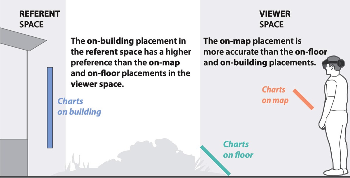
We investigate the potential impact of visualization placement on enhancing the user experience for outdoor augmented data tours, the tours that rely on situated data visualization in augmented reality (AR). Little is known about the optimal placement of outdoor AR information visualizations.
Stacks Image 1441
Our study provides insight into the design of augmented data tours in outdoor environments: positioning AR visualizations close to participants seems to increase reading accuracy, and recalling information from visualizations placed on the floor seems to be more difficult than recalling information from visualizations placed on buildings.

Drawing Connections: Designing Situated Links for Immersive Maps

Stacks Image 1450
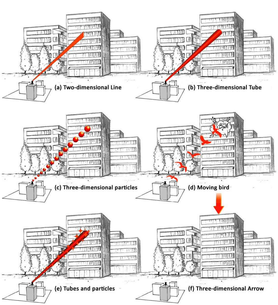
We explore the design of situated visual links in outdoor augmented reality (AR) for connecting miniature buildings on a virtual map to their real-world counterparts.
Stacks Image 1457

Deimos: A Grammar of Dynamic Embodied Immersive Visualisation Morphs and Transitions

Stacks Image 352
We present Deimos, a grammar for specifying dynamic embodied immersive visualisation morphs and transitions.

Tangible Globes for Data Visualisation in Augmented Reality

Stacks Image 1415
Stacks Image 1418
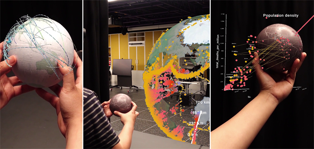
We built physical (tangible) globes that are tracked in space and augmented and linked with virtual visualisations. We demonstrate a set of use cases using our physical globes as a tangible input device for interacting with virtual globes and maps, and linking an augmented globe to an abstract data visualisation.

A Design Space For Data Visualisation Transformations Between 2D And 3D In Mixed-Reality Environments

Stacks Image 372
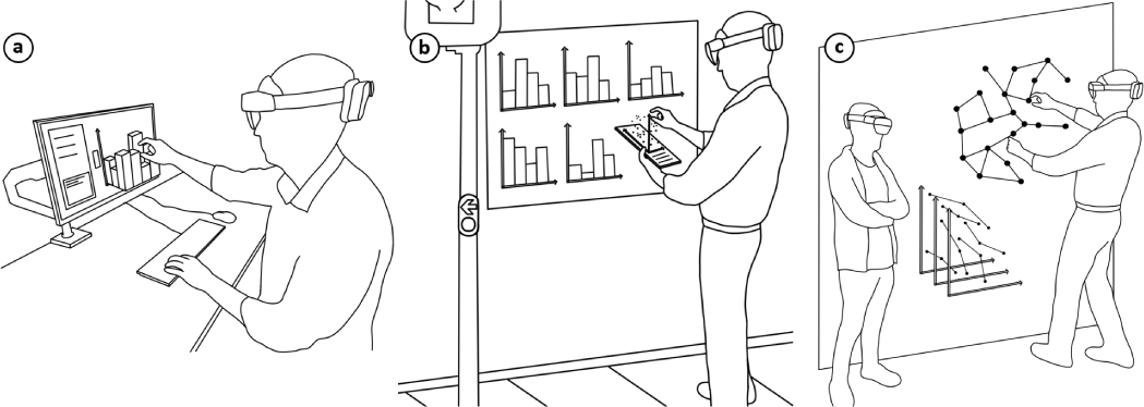
Users should have the freedom to transform mixed-reality visualisations seamlessly between 2D screens and 3D space as needed. We explore the design space for such transformations and demonstrate it with multiple exemplary techniques.
Stacks Image 377

Extrusion of a shortest path in a spatial network.

Stacks Image 381

Matrix extrusion creates juxtaposed views from a single attached 2D scatterplot by grabbing the top-right corner.

Proxemic Maps for Immersive Visualisation

Transforming map geometry with proximity to the user

Stacks Image 395
Proxemic maps are virtual maps in immersive environments that react to distance and orientation relative to the user. We discuss proxemic interactions that alter the content and type of maps, including changing scale, symbolization, type of visualization and geometry. We propose a novel transformation that changes the geometry of maps based on their proximity to users. Users move the map back and forth and the map transitions between ring, horizontal, vertical and cylindrical geometries. The ring geometry surrounds the user and aligns features on the map with features in the real world.
Stacks Image 1384

Proxemic map transition from a horizontal to a vertical map. The map rotates from a horizontal orientation to a vertical orientation as the distance increases.

Virtual Ecology

Exploring Australian landscape dynamics in virtual reality
Stacks Image 408
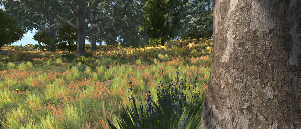
In collaboration with CSIRO, we develop a virtual reality ecosystem walkthrough to communicate the dynamics of ecosystems, their seasonal changes and response to disturbance.

This cross disciplinary collaboration resulted in a VR experience of an Australian Box Gum Grassy Woodland landscape, an endangered eucalypt woodland ecosystem that is difficult to observe in its pre-European colonisation form. We were able to demonstrate the great potential for education, public engagement, and land management, by means of a series of workshops and user studies at the Department of the Environment and Energy, Canberra with 27 experts in environmental policy development, plant ecology, evolutionary biology, and paleoecology.

More information on the project page.

Embodied gesture interaction for immersive maps

Immersive maps in which the user is closer to the data

Our work explores the use of embodied interaction for immersive maps. We propose four design considerations for embodied maps and embodied gesture interaction with immersive maps. We also present an example of an immersive flow map with a series of novel embodied gesture interactions.
Stacks Image 431

Example embodied interaction: Filter values by shaking the map.
Left: before shaking, the map shows all flow symbols. Center: Shaking removes flows with small values. Right: After shaking, the map only shows flows with large values.

The MADE-Axis: a modular actuated device to embody the axis of a data dimension.

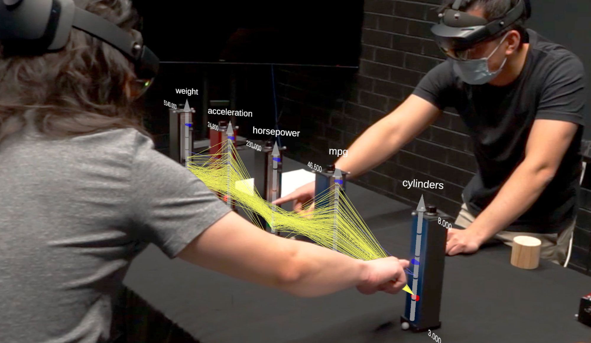
Composable controller units with two actuated sliders and a rotary encoder for creating multi-dimensional visualisations in VR and AR.
Stacks Image 445
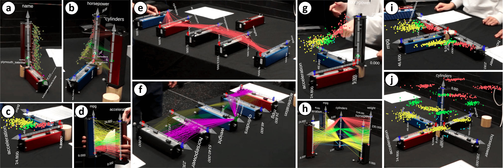
Visualisations constructed by study participants with MADE-Axis: (a, b, c, d) examples of 2D visualisations, (e) parallel coordinates plot (PCP) with filtered items using sliders, (f) PCP with selected items (highlighted in purple) and non-selected items (semi-transparent), (g, h) examples of 3D visualisations, (i, j) 3D scatterplot matrices with shared data axes.
Stacks Image 452

A Design Space Exploration of Worlds in Miniature

Worlds-in-Miniature are interactive worlds within a world. We contribute a design space for Worlds-in-Miniature based on seven design dimensions, describe existing Worlds-in-Miniature, and generate new examples.
Stacks Image 472

Seven design dimensions for Worlds-in-Miniature

Maps Around Me: 3D Multiview Layouts in Immersive Spaces

An exploration of Immersive Multiview Maps in Virtual Reality

Stacks Image 494

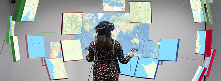
A spherical cap layout surrounding a large central overview. Visual links and colour hues indicate hierarchical groupings.

Our immersive interface allows users to create large hierarchies of multiple maps at different scales and arrange them in 3D space.
Stacks Image 1389

Layout types: planar (left), spherical cap (center) and spherical (right).

Shared surfaces and spaces: collaborative data visualisation in a co-located immersive environment

Collaborative visualisation and analysis of multidimensional data in VR with FIESTA
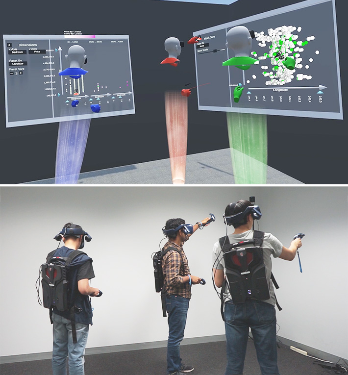
This paper reports on a study in which teams of three co-located participants are given flexible VR visualisation authoring tools to allow a great deal of control in how they structure their shared workspace.
Stacks Image 513

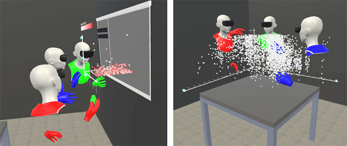
Teams of three participants collaborate on 3D scatterplots
Stacks Image 519

Transitions between 2D choropleth map, 3D prism map and bar chart in immersive environments

Tilt Map transitions from 2D choropleth maps to 3D prism maps to 2D bar charts
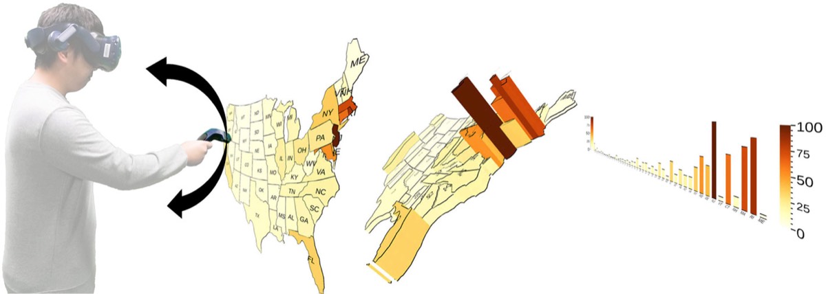
We introduce Tilt Map, a novel interaction technique for intuitively transitioning between 2D and 3D map visualisations in immersive environments. Our user study indicates benefits for Tilt Map in user preference, accuracy (versus side-by-side visualisations) and time (versus toggling between visualisations).
Stacks Image 536

Inclination for transitioning between choropleth map, prism map and bar chart

Immersive Visualisation with Bar Graphics

Bar Charts and Maps with Bars for Immersive and Situated Visualisation
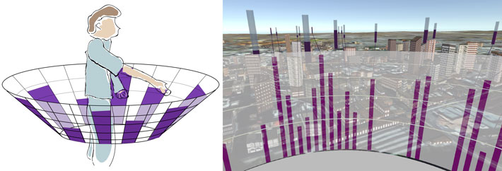
The Egocentric Bar Chart combines virtual bars placed in a real landscape with a virtual 360° bar chart arranged around the user. The Circular Map with Bars combines bars in a real landscape with a 360° virtual map showing bar graphics. These visualisations are designed for inspecting point data for immersive and situated visualisation.
Stacks Image 555

Egocentric Bar Chart

Stacks Image 560

Circular Map with Bars

Gesture Interaction for Maps in Augmented Reality

Gestures for immersive maps

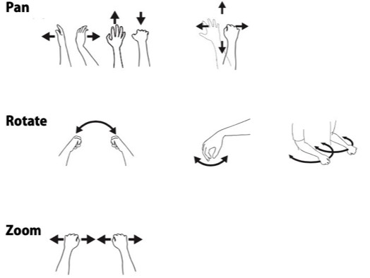
We explore and evaluate ways to interact with AR maps with hand and foot gestures. We use head-mounted AR and VR displays like the Meta 2, Hololens, and HTC Vive Pro in combination with the ZED Mini, Motion Leap, mobile eye tracking hardware and the Unity 3D engine.
Stacks Image 581
We conducted an elicitation study to identify commonly suggest hand and foot gestures for controlling augmented reality maps.
Stacks Image 585

Immersive Flow Maps

Origin-Destination Flow Maps in Immersive Environments

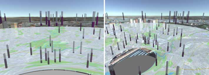
How should we visualise origin-destination flow data with virtual and augmented reality? We explore three different spatial encodings for flow maps. Our work suggests that careful use of the third spatial dimension can resolve visual clutter in complex flow maps.

Maps and Globes in Virtual Reality

Mapping the world in VR

Stacks Image 621
We compared globes, flat maps, egocentric globes, and curved maps for visualising world maps in virtual reality. We found that globes are often preferable for geographic visualisation in mixed-reality.
 

2D Terrain

Ambient Occlusion for Terrain Shading
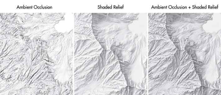
Ambient occlusion is widely used in computer graphics to accentuate areas in a three-dimensional scene that are hidden from bright lighting. On maps, ambient occlusion adds spatial depth and nuanced texture to shaded relief images. Ambient occlusion images for maps can be calculated from digital elevation models using the Eduard relief shading application.
Stacks Image 1474

Cartographic Relief Shading with Neural Networks

Replication of hand-drawn relief shading with U-Net neural networks
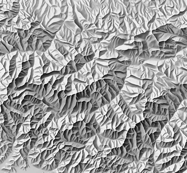
Deep neural networks are trained with manual shaded relief images of the Swiss topographic map series and terrain models of the same area. The networks generate shaded relief that closely resemble hand-drawn shaded relief art. The networks learn essential design principles from manual relief shading such as removing unnecessary terrain details, locally adjusting the illumination direction to accentuate individual terrain features, and varying brightness to emphasise larger landforms.
Stacks Image 656

Shaded relief of the Caucasus Mountains created with a neural network trained with a manual relief shading of Switzerland.

Elevation Models for Reproducible Evaluation of Terrain Representation

Elevation models to promote, evaluate, and compare terrain representation techniques

The goal is to increase the reproducibility of terrain rendering algorithms and techniques across different scales and landscapes.

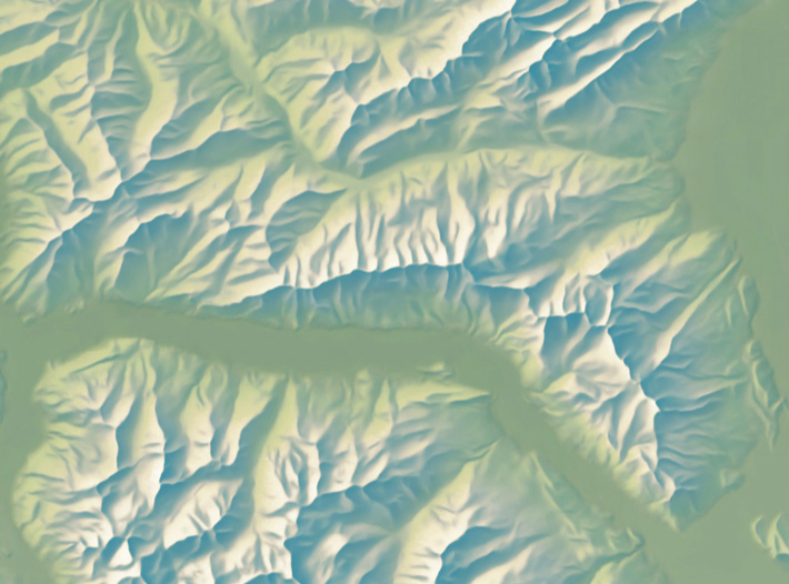
The elevation models are best accessed at http://shadedrelief.com/SampleElevationModels/.
Stacks Image 676

Churfirsten, Switzerland: One of the proposed elevation models.

Terrain Generalisation for Maps

Simplifying terrain to better see it
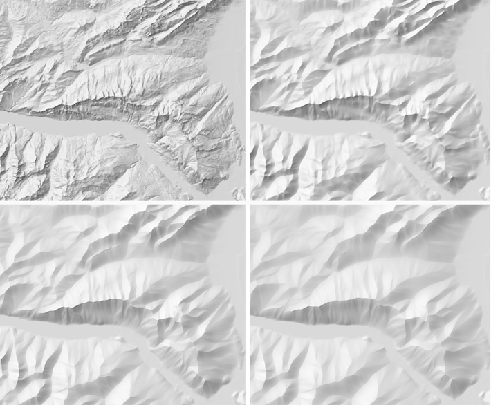
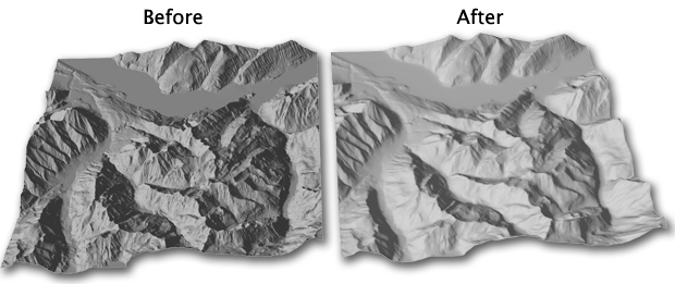
Interactive methods for generalising elevation models enable map authors to selectively remove superfluous details and enhance important terrain features.
Stacks Image 694
Terrain Sculptor is an application for the generalisation of terrain models for relief shading. It removes irrelevant details and accentuates important features.

Terrain Equalizer is an application for frequency filtering of terrain models. Terrain detail can be adjusted with the viewing distance.
Stacks Image 700

Supplementary Contour Lines

Automated creation of supplementary contours
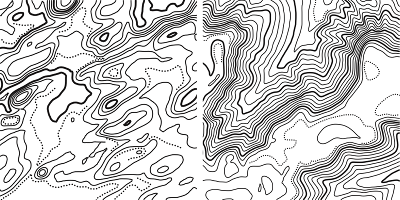
Supplementary contour lines are placed between regular contour lines to visualize small but important forms that regular contour lines are unable to show. On topographic maps, typical forms are hillcrests, depressions, saddles, terraces, banks, and levees. We document cartographic design principles for the selection of supplementary contour lines for topographic maps, and present an automated method for their placement.
Stacks Image 717

Supplementary contour lines (dotted) and regular contour lines.

Natural-colour Maps

A hyperrealistic map style
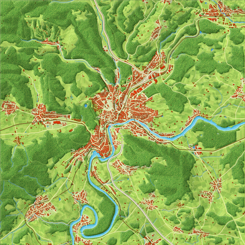
Natural-color maps are topographic maps with a particularly vivid and comprehensible symbolisation, uniting cartographic abstraction with natural appearance. We develop computer graphics methods for creating more engaging and expressive natural-colour map styles.
Stacks Image 736

A natural-color map of Schaffhausen, Switzerland.

Coloured Relief Shading

Modulating terrain colour with exposure to illumination
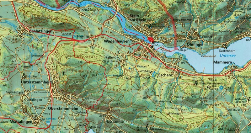
Maps with coloured relief shading, modulated by elevation and by exposure to illumination, present topography in a particularly vivid and descriptive manner. This digital method uses a colour look-up table and a digital elevation model. The colour look-up table has colours for all combinations of initial grey values and terrain elevations, and is constructed from interactively placed colour reference points.
Stacks Image 752

Section of the school map of Schaffhausen, Switzerland

Relief Shading

Improving the perception of terrain on 2D maps
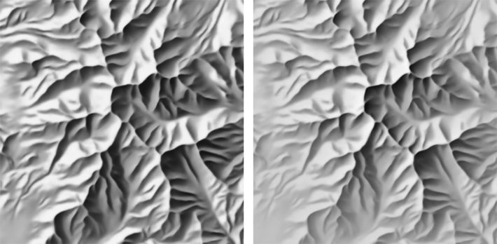
Existing digital shading methods ignore principles that cartographers developed in the pre-digital era. The goal is to transfer manual relief shading techniques to the digital realm.
Stacks Image 768

Shade relief without (left) and with (right) aerial perspective simulation.

Illuminated Contour Lines

Tanaka contours
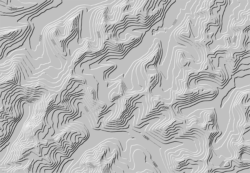
Illuminated and shadowed contour lines help map readers interpret the third dimension on a map more accurately and quickly when compared to conventional contour lines. We developed a contouring algorithm for Pyramid Shader that allows cartographers to quickly and easily create customized illuminated and shadowed contour maps. Contour line widths can be varied and colors can be alternated between illuminated and shadowed slopes.
Stacks Image 784

Illuminated and shadowed contour lines.

Rock and Scree Drawing

Swiss-style mountain mapping
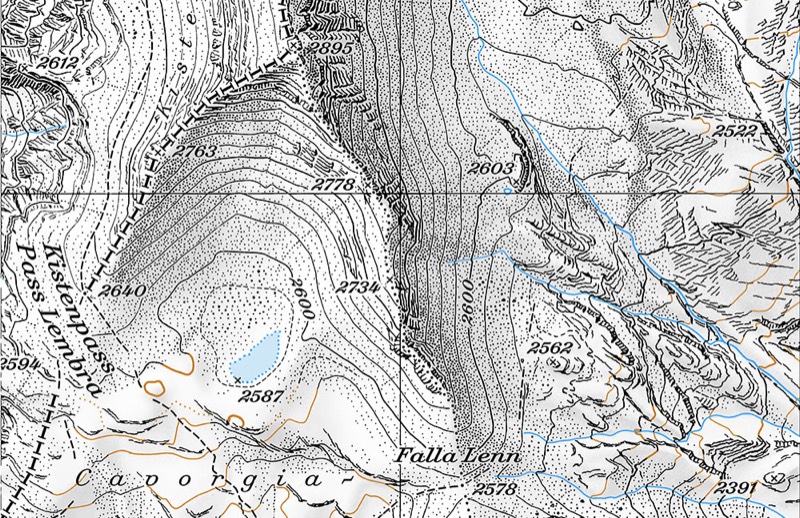
Swiss-style rock and scree drawing for topographic maps requires considerable training and is very time intensive. The goal of this research is to automate this process. Our Scree Painter software is a specialised tool for the generation of scree patterns for topographic maps. Scree Painter is used by the Swiss Federal Office of Topography swisstopo for generating scree dots for their renowned map series.
Stacks Image 807

Digital scree rendering with Scree Painter (swisstopo map 1193 Tödi)

Spot Heights

Elevations of peaks, saddles and depressions on topographic maps
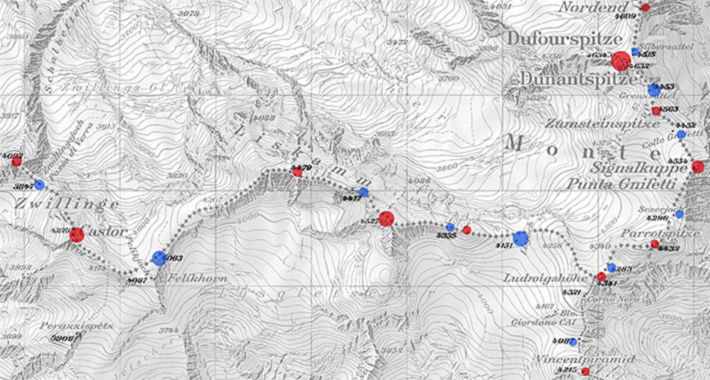
Spot heights and soundings indicate terrain elevation. We propose a method for the automated selection of spot heights locations representing peaks, saddles and depressions. Our results are close to reference spot heights produced manually by swisstopo cartographers.
Stacks Image 827

Spot heights locations selected by the proposed method; red: summits; blue: mountain passes. Circle size indicates importance values. Background: 1:50,000 map by swisstopo.

Hypsometric Tinting

Showing elevation with colour
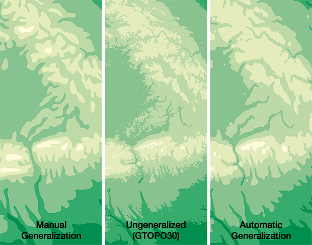
We developed a method for the generation of hypsometric layers based on percentile filtering. The level of details is controled by hydrological accumulation flow, and collaborated with Tom Patterson, US National Park Service, to evaluate cross-blended hypsometric tinting.
Stacks Image 843

Hypsometric tinting for atlas maps.


3D Maps

Look-From Camera Control for 3D Terrain Maps

Lightweight interactive camera control techniques for 3D terrain maps

Stacks Image 865
We introduce three lightweight interactive camera control techniques for 3D terrain maps on touch devices based on a look-from metaphor. These techniques complement traditional touch screen pan, zoom, rotate, and pitch controls and allow viewers to quickly transition between top-down, oblique, and ground-level views.

Animated Relief Shearing

Enhancing terrain perception for interactive maps

Stacks Image 881
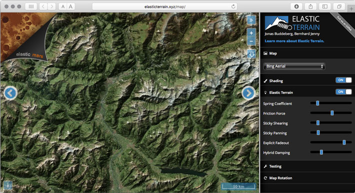
Relief shearing exposes depth and shape information in terrain maps using ephemeral animations in 2D maps. Relief shearing improves depth perception when compared to standard 2D and perspective views.
Stacks Image 888

ElasticTerrain.xyz is a demo website with worldwide terrain shearing by Jonas Buddeberg.

Plan Oblique Relief

Seeing the third-dimension on flat maps

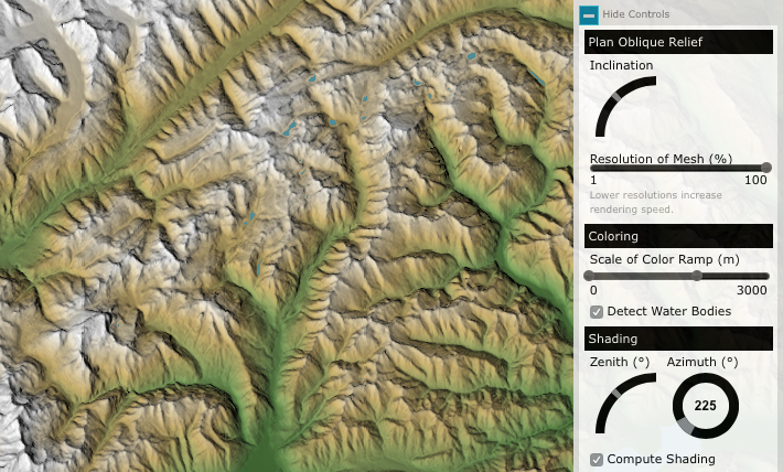
Plan oblique relief is a digital technique for rendering three-dimensional terrain on otherwise planimetric (conventional flat) maps. Landforms shown realistically in side view have an illustrative quality that appeals to readers.

Explore the interactive Plan Oblique Europe map or the static Crinkled Watercolor Map.
Stacks Image 905

Plan Oblique Europe
Map by Jonas Buddeberg, FOSS4G Map Gallery Most Unique Map Award 2014, FOSS4G People’s Choice Award 2014, NACIS Student Dynamic Map Competition.

3D Natural Hazard Maps

Communicating natural hazards with 3D maps
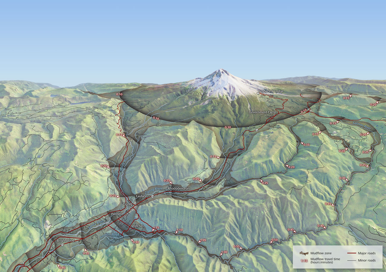
The recommended response to floods, tsunami, and volcanic hazards is for people to seek high ground, and many hazard maps produced for the public emphasise the safety of higher elevations. Because traditional contour maps are difficult to read for many, we evaluated more effective 3D perspective hazard maps.
Stacks Image 922

Lahar hazard zones and arrival times for Mt Hood, Oregon.
Map by Charles Preppernau, National Geographic Award in Mapping 2015, CaGIS Map Design Competition.

Projections for 3D Maps

Manipulating terrain to increase its readability
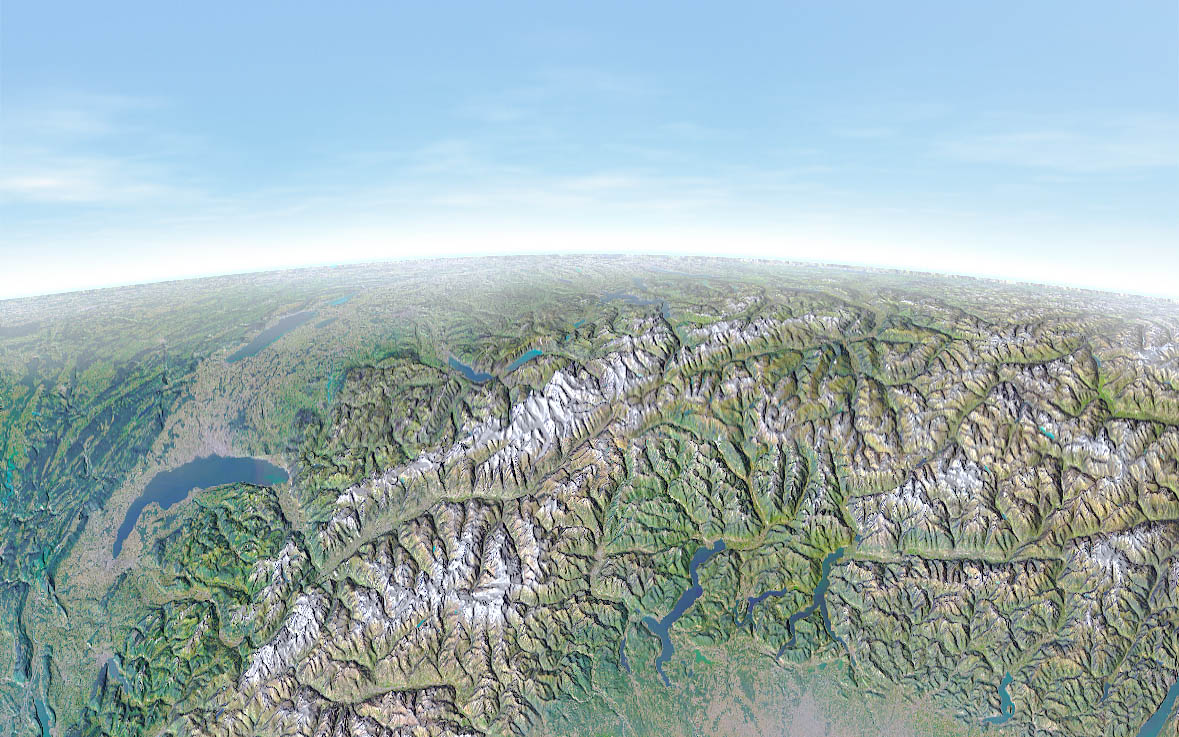
Why not deform the terrain for 3D maps? Watch the movie above to see how the size, orientation, and shape of individual landscape features can be adjusted to adjust their visibility and make the map easier to read.
Terrain Bender applies progressive bending to digital terrain models. It offers interactive tools to add a bent base to a digital terrain model. Terrain Bender has been used by National Geographic cartographers to create maps for their magazine, for example, a map of Mt. St. Helens.
Stacks Image 942

Map with progressive projection created with Terrain Bender
Stacks Image 948

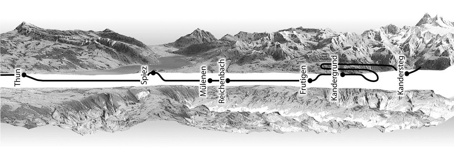
Strip format panorama map along a train track. The train track was rectified to a straight line along the central axis.


Map Design

Quantitative Data Visualisation on Virtual Globes

We compare 2D bars, 3D bars, and circles with tangential, normal, and billboarded orientation. We find that aligning primitives tangentially on the globe’s surface decreases the accuracy of area-proportional circle visualisations, while the orientation does not have a significant effect on the accuracy of length-proportional bar visualisations. We also find that tangential primitives induce higher perceived mental load than other orientations.

Stacks Image 967

Video Maps

Extending web maps with video layers

Video maps contain georeferenced video streams that allow for new types of interactivity. Video layers can be combined with traditional vector layers, and the projection of a video layer can be adjusted by the user.
Stacks Image 986

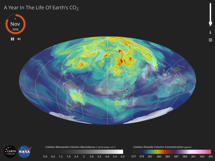
A Year in the Life of Earth's CO₂, an interactive video map that visualises a high-resolution NASA computer model of global atmospheric carbon dioxide distribution.

Flow Maps

Design principles and algorithms for origin-destination flow maps

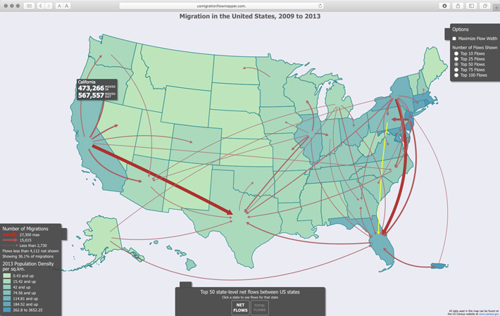
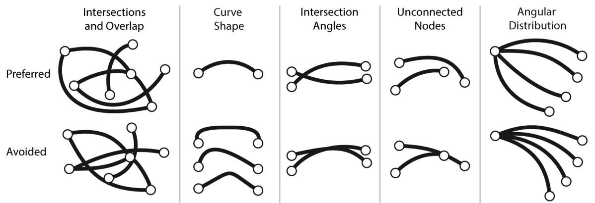
We develop algorithms for creating flow maps showing linear movements between two places with curved lines of varying width. The geometry of flows is bent to reduce the number of graphic conflicts among flows with the goal to increase readability.
Stacks Image 1005

Migration in the United States, 2009–2013, an interactive flow map of migration in the United States using a force-directed layout. Map by Daniel Stephen.
Stacks Image 1009

Preferred and avoided arrangements of flows, from Design principles for origin-destination flow maps.

Color Oracle

Design for colour-deficient vision
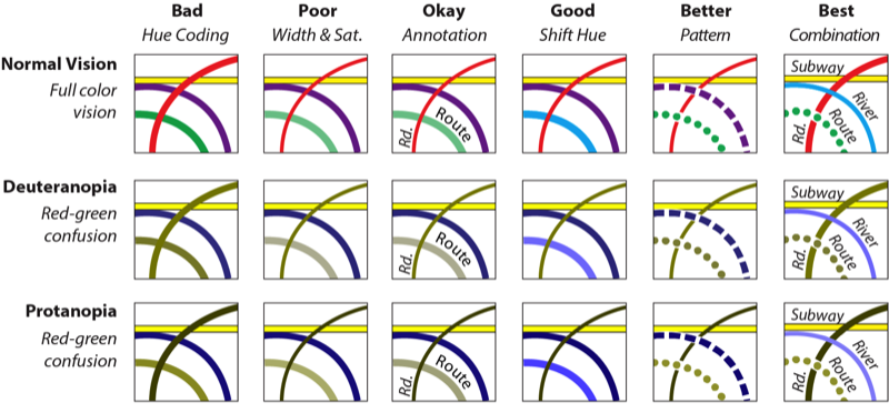
Eight percent of men are affected by color vision impairment – they have difficulties distinguishing between colours. Barrier-free color design is important for this large group of readers.
Color Oracle is a free software application that simulates colour-deficient vision to help designers ensure their graphics are barrier-free.
Stacks Image 1027

Automatic Legends for Proportional Symbol Maps

Rotate your device to landscape orientation to see the legend.

Maximum:
Minimum:
Size:
Font Size:
Distance:
Breaks:
A self-adjusting legend for proportional symbol maps displays intermediate symbols for round values (for example, 100, 250, 500, 1000, 2500, etc.). The legend always displays a set of appropriate intermediate symbols, even when the minimum and the maximum values are very large or very small.

Dot Maps

Graduated dot maps: a new mapping technique
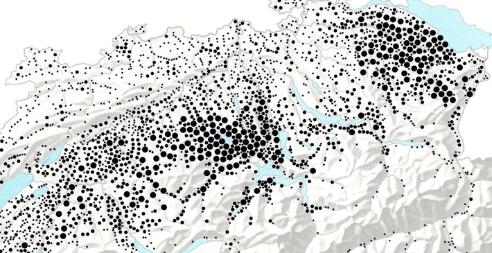
Graduated dot maps arrange dots with blue-noise patterns to avoid overlap and use clustering algorithms to replace small, densely packed dots with dots of larger sizes. Our user study indicates that map users can more accurately extract values from graduated dot maps than from traditional dot maps with a single dot size.
Stacks Image 1061

Graduated dot map with three dot sizes. ©Atlas of Switzerland, sheet 51, 1977.

Altases for E-books

Map design for tablet computers

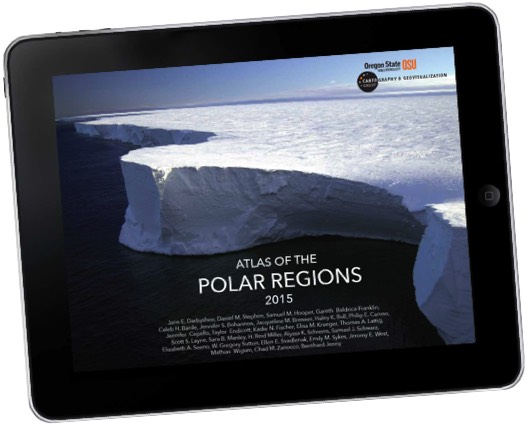
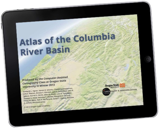
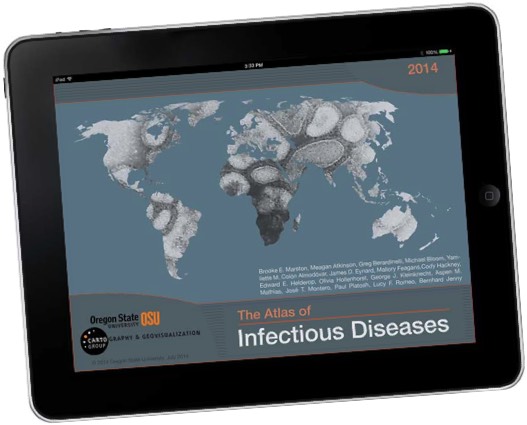
Digital cartographic atlases have replaced traditional paper atlases, but cartographers have not yet fully embraced the potential of multi-touch tablet computers, such as the iPad. We explored the characteristics of e-book atlases, which are positioned between traditional printed atlases and digital atlas information systems, and created three e-book atlases for iBooks.
Stacks Image 1080
Stacks Image 1085
Stacks Image 1090

CaGIS David Woodward Award for Best Electronic Map 2016
International Map Industry Association IMIA: Best Student Electronic Map 2015
NACIS Student Dynamic Map Competition 2015
New Mapmaker Award by the British Cartographic Society and ESRI UK 2015

British Cartographic Society and National Geographic Society New Mapmaker Award 2014
CaGIS Best of Show 2014
CaGIS David Woodward Award for Best Electronic Map 2014
NACIS Student Dynamic Map Competition 2014

Game Devices

Navigating geovisualisation with gamepads
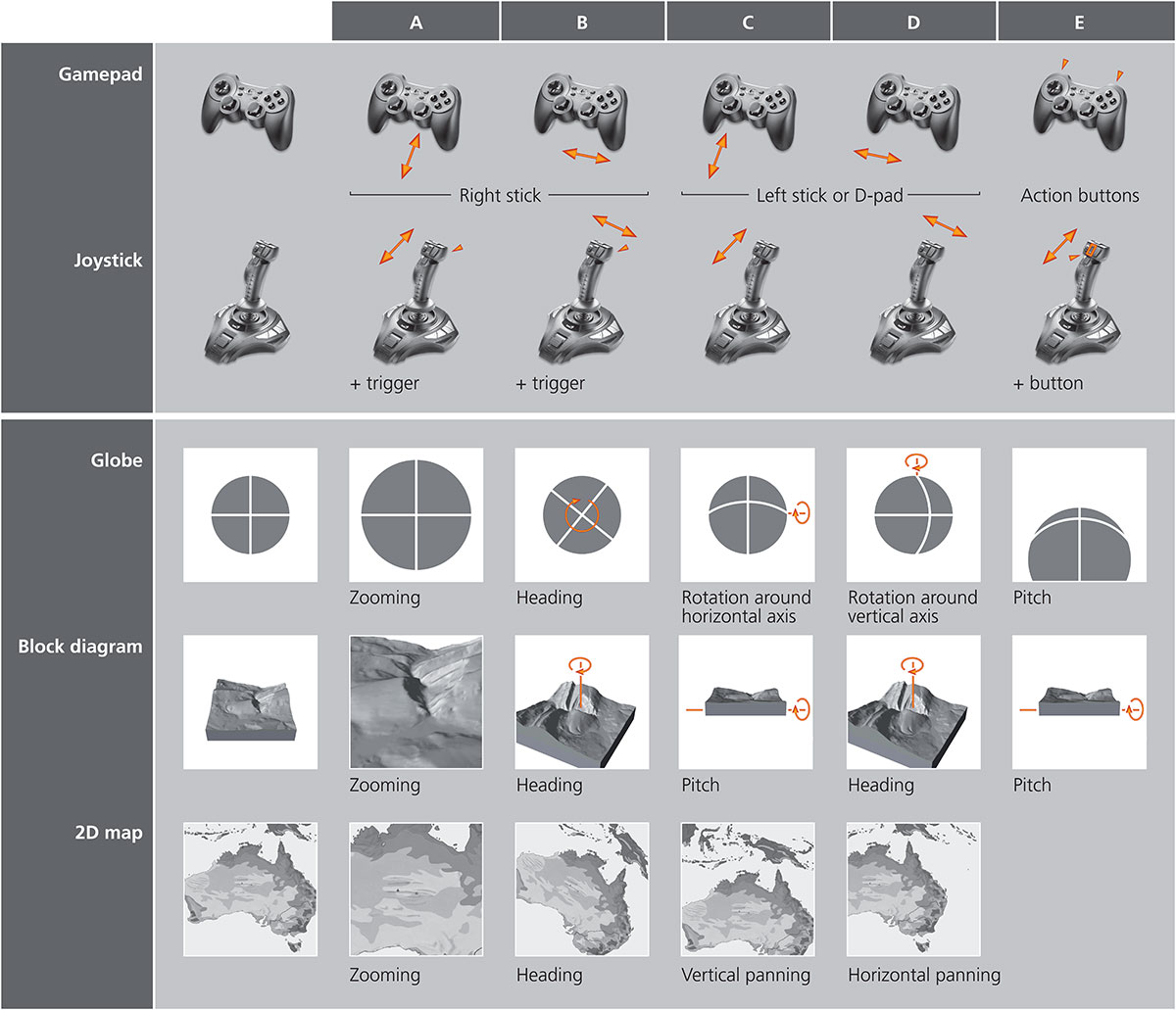
Globes, block diagram and maps can be connected with game devices, such as gamepads, opening new ways of interaction with geospatial visualisations.
Stacks Image 1133
 

Map Projections

Equal Earth Map Projection

A projection for world maps that does not distort area
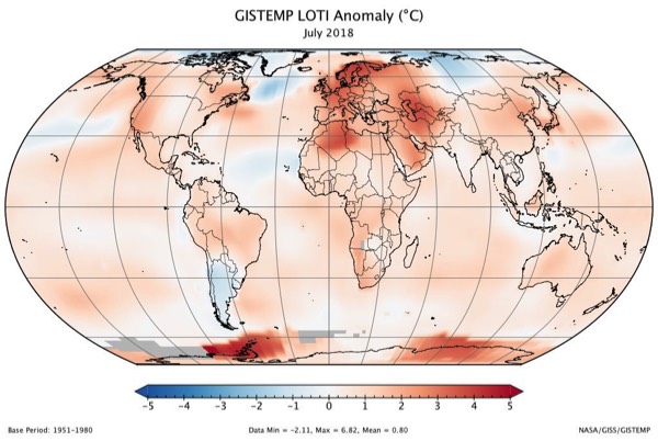
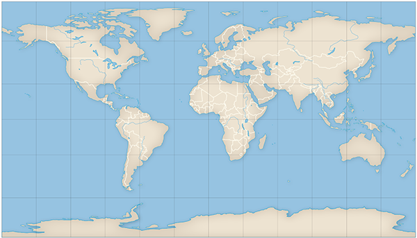
The Equal Earth map projection is a new equal-area pseudocylindrical projection inspired by the widely used Robinson projection. Unlike the Robinson projection, it retains the relative size of areas.
Stacks Image 1178

NASA temperature anomalies map with the Equal Earth projection

Adaptive Composite Map Projections

A replacement for the web Mercator projection

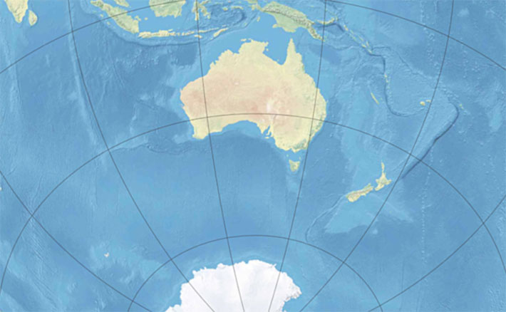
Adaptive composite map projections are an alternative to the web Mercator projection used by Google Maps and all other major web maps. They show large landmasses without area distortion, and users can rotate the map similar to a globe.
Stacks Image 1202

Selecting Map Projections

Projection Wizard for choosing the best projection

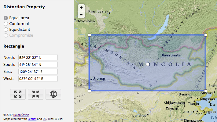
The interactive Projection Wizard by Bojan Šavrič helps cartographers select a map projection that is optimized for the geographical area and the map format. We also investigated user preferences and guidelines for selecting projections for world maps.
Stacks Image 1226

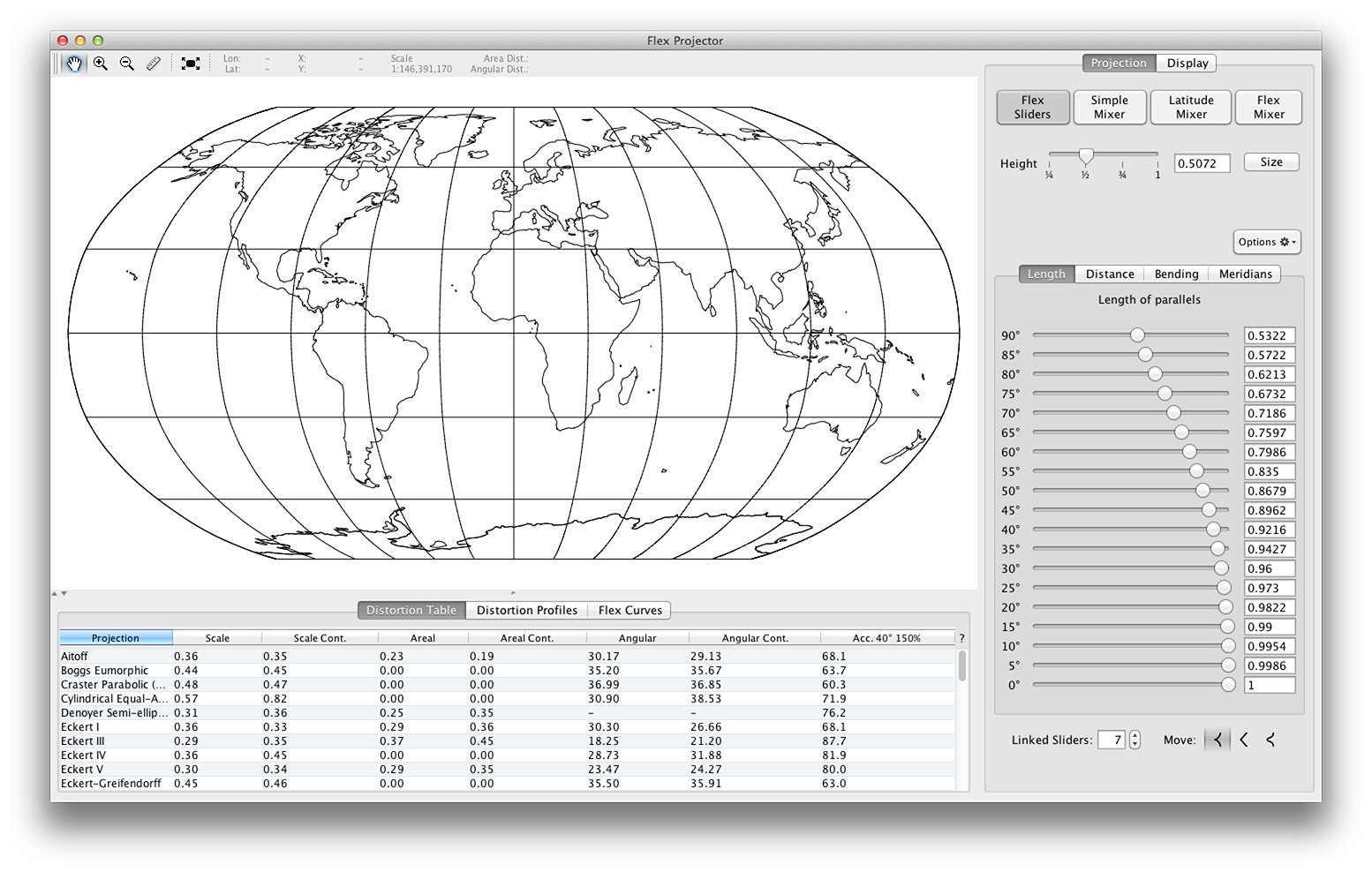
Flex Projector

Designing custom map projections

Flex Projector is a software application for designing new map projections for world maps. New projections can be generated from scratch, existing projections can be modified, or two source projections can be mixed to create a new one.
Stacks Image 1249

New Map Projections for World Maps

Balancing between areal and angular distortion

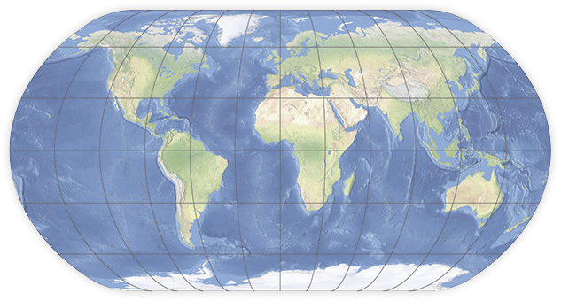
The Natural Earth I and II are new projections with rounded corners where the pole lines and bounding meridians meet.
Stacks Image 1266

Natural Earth I

The Patterson Cylindrical projection was developed in a similar way.
Stacks Image 1272

Patterson cylindrical


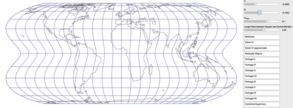
In 1989, Herbert Hufnagel introduced a generalization of the Mollweide projection, resulting in a family of pseudocylindrical equal-area projections. The Mollweide, Eckert Ⅳ and Wagner Ⅳ projections are members of this family. Explore Hufnagel’s projection with this interactive tool at https://bojansavric.projectionwizard.org/Hufnagel.html
Stacks Image 1279
 

Distortion Analysis

MapAnalyst

Analysing distortion patterns in old and schematic maps

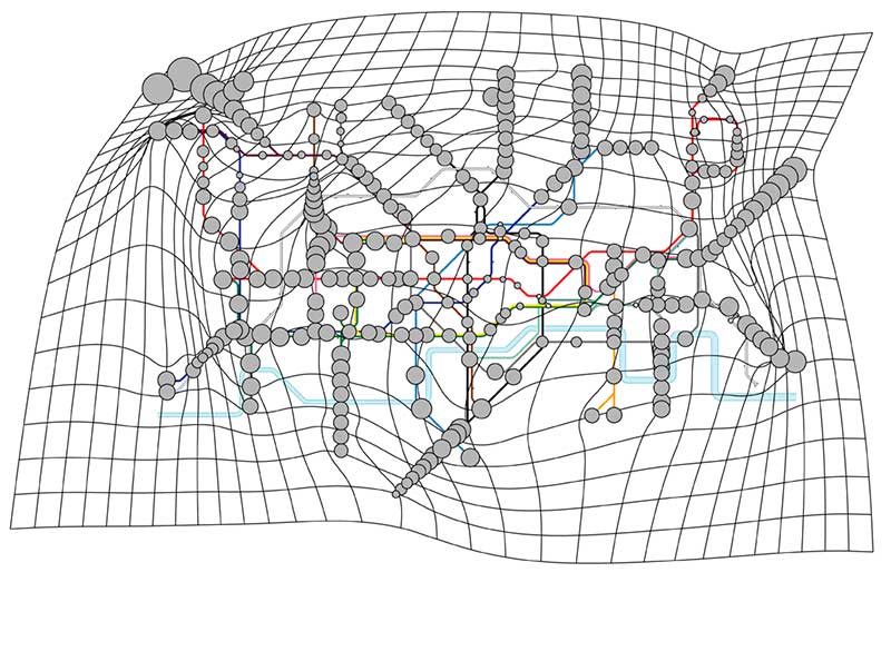
  • Stacks Image 1296

    Distortion grid and position differences for the London Underground map

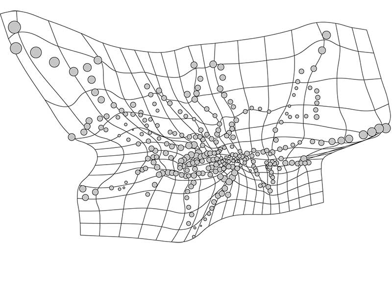
  • Stacks Image 1297

    Distortion grid for the London Underground map on a Mercator projection

  • Stacks Image 1298

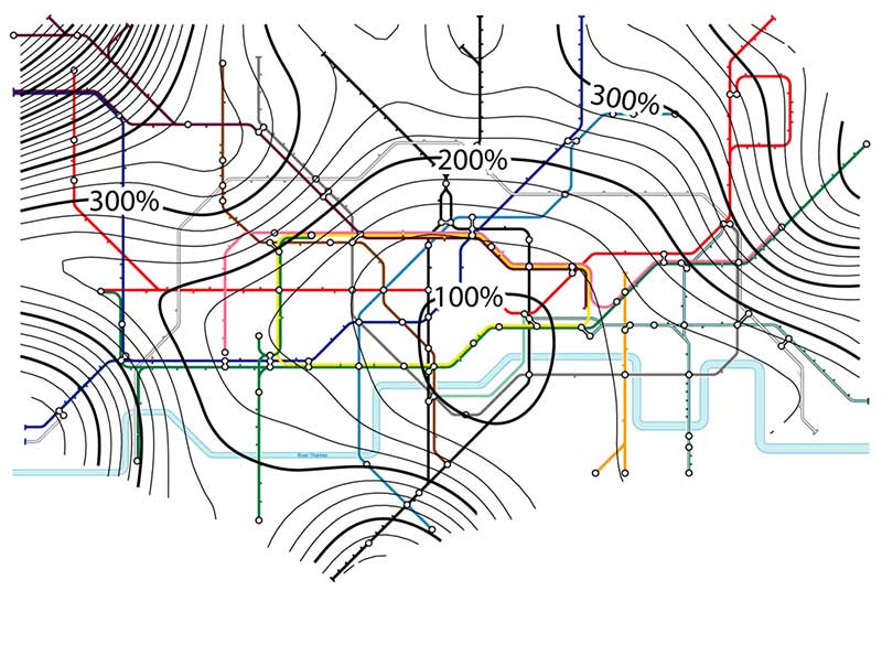
    Isolines of local scale for the London Underground map

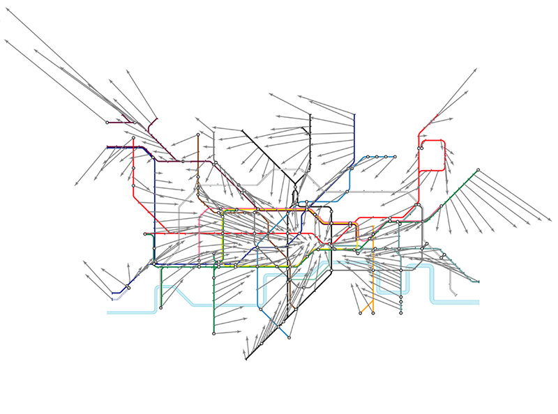
  • Stacks Image 1308

    Displacement vectors for the London Underground map

MapAnalyst is a specialised software for the geometrical analysis of map diagrams and old maps. It can generate distortion grids, displacement vectors, and isolines of scale and rotation to illustrate local map deformation.

MapAnalyst was reviewed in the journal Cartographica and was judged "a great piece of software for analysing old maps, and one would expect MapAnalyst to be a welcome addition to the desktops of map researchers everywhere". MapAnalyst has been used by several map historians for the study of old maps.

Cartographic Heritage

Geometryic analysis for the history of cartography
Stacks Image 1328

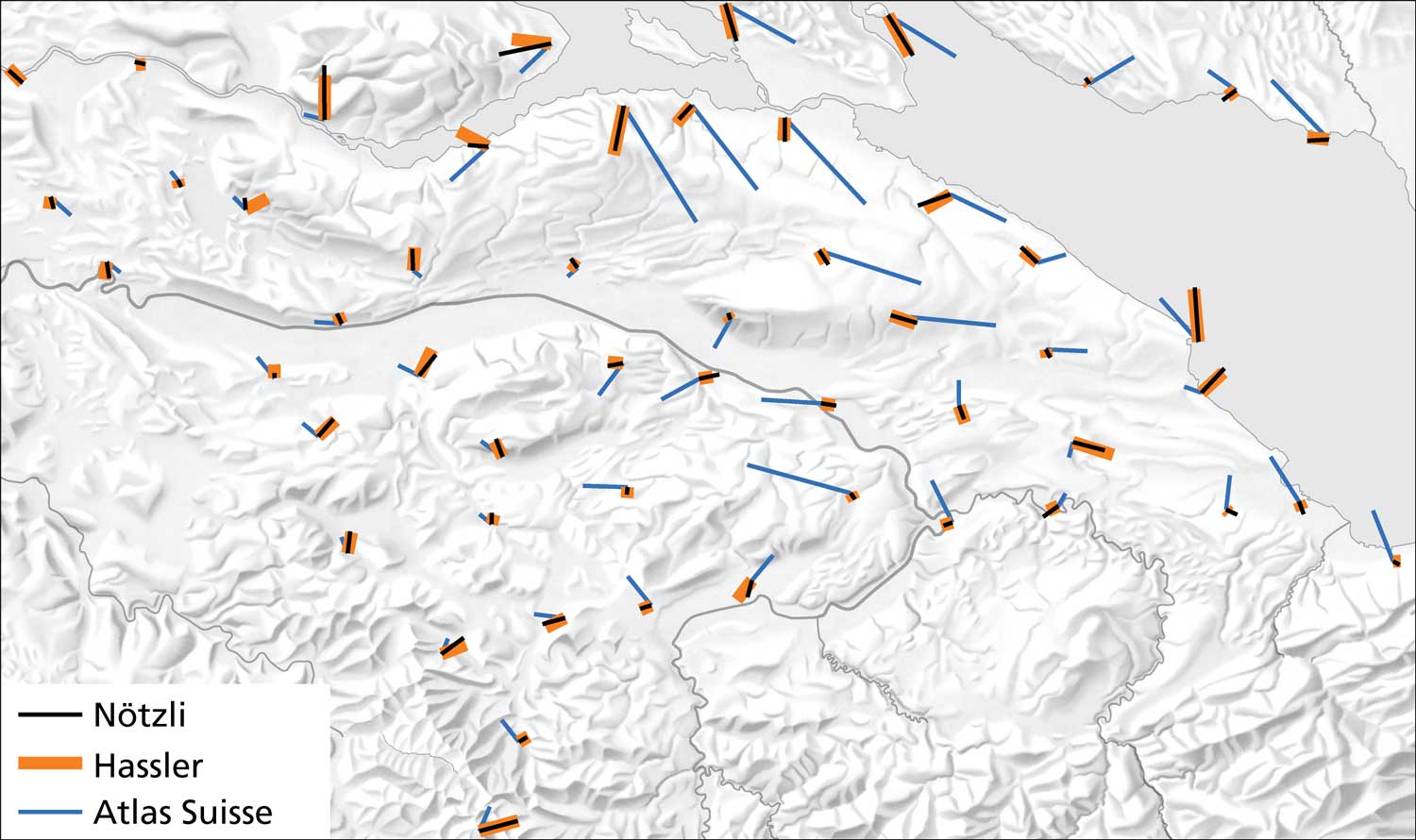
Orange is a copy of black, but not blue: The displacement vectors of the Hassler and Nötzli maps coincide, the vectors of the Atlas Suisse are spatially unrelated. Analysis and visualisation with MapAnalyst (Data courtesy of Dr. Martin Rickenbacher, Federal Office of Topography swisstopo).

Old maps are increasingly used as a source for historical research. As with every source, when old maps are georeferenced and information is extracted for historical studies, the accuracy and reliability of the geometric and semantic information must be assessed. A series of geometric transformations can transform control points of a modern reference map to the coordinate system of an old map. Based on these transformed points, the planimetric and geodetic accuracy of the old map can be computationally analysed and various visualisations of space deformation generated. The results are graphical representations of map distortion, such as distortion grids or displacement vectors, as well as statistical and geodetic measures describing the map geometry (e.g., map scale, rotation angle, map projection). The visualisations help the map historian to assess the geometric accuracy of historical geographical information before using the data for geo-historical studies. The visualisations can also provide valuable information to the map historian about the history of a particular map and its creation.
 

Software

Globes for the Apple Vision Pro shows highlights from Stanford's David Rumsey Map Center right in your home.
Eduard creates beautiful shaded relief image from elevation models.
Flox creates origin-destination flow maps.
Color Oracle simulates colour-deficient vision.
FlexProjector creates custom map projections.
MapAnalyst visualises the geometric accuracy of old maps.
Pyramid Shader, Terrain Sculptor and other software to visualise terrain.
Scree Painter visualises scree on mountain maps.